


Results 11 to 20 of 34
-
08-16-2011, 12:53 AM #11Junior Member

- Join Date
- Aug 2011
- Posts
- 20
Re: A Study of the Baltimore Orioles Cartoon Bird Cap Logos
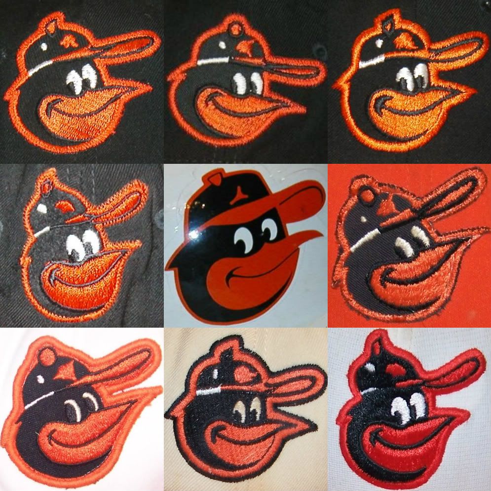
...and just for fun, the whole dang family!!!
-
08-16-2011, 12:54 AM #12Junior Member
- Join Date
- Aug 2011
- Posts
- 20
Re: A Study of the Baltimore Orioles Cartoon Bird Cap Logos
[quote name='Gothamite' timestamp='1312856005' post='1610986']
One thing that might be worth considering is that some players might have continued to wear old caps after the team changed suppliers. That's a problem I had doing my Brooklyn Dodger research - maddening.
Great job on the recap! I never realized that there were so many variations of this logo.
[/quote]
Thanks Gothamite. I did that into consideration. Also, most of the baseball card pictures were taken during Spring Training back then, so that's another thing to consider when using them as a reference.
Your Brooklyn Dodger "B" thread was sort of an inspiration for this thread. I share your frustrations on wishing New Era/Cooperstown would get these throwbacks right!
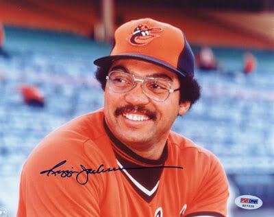
Here's a cool pic of Reggie Jackson sportin' the '75-'76 alternate orange panel AJD cap:
And here's the crappy remake by New Era/Cooperstown:
I wouldn't expect New Era to reproduce a 100% Nylon version of this cap to exact specifications, as it was originally made, but like I said earlier, at least get the logo right.
Here's an American Needle version that's even worse!
From the description:
"Own a little piece of history with American Needle's Baltimore Orioles 1975-76 Alternate Cooperstown Cap, a precise replica of what the legendary pros once wore."
Haha! Yeah right!
-
08-16-2011, 01:03 AM #13Junior Member
- Join Date
- Aug 2011
- Posts
- 20
Re: A Study of the Baltimore Orioles Cartoon Bird Cap Logos
[quote name='Jungle Jim' timestamp='1312464800' post='1607694']
When you consider the batting helmet logos the Orioles used during that era, there are even more differences. Eddie Murray's 1978 Topps card shows him wearing a helmet where the bird has a white line in its beak rather than a black line. Also, the size of the white panel on the helmets changed at some point (although that's not really logo related.)
Rather than repeating myself, I'll link to a post I made about it back in April...
http://boards.sports...dpost&p=1526945
[/quote]
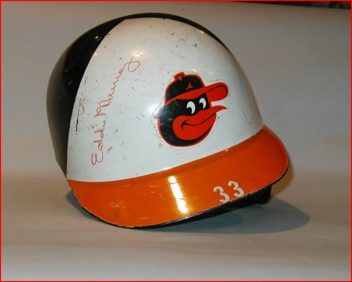
Aw man.. the helmets are a whole other mess, but in my research, I think I may have found out why. It's because some of the helmet logos are hand painted, while others were affixed with a decal.
The painted logos ranged from really good:
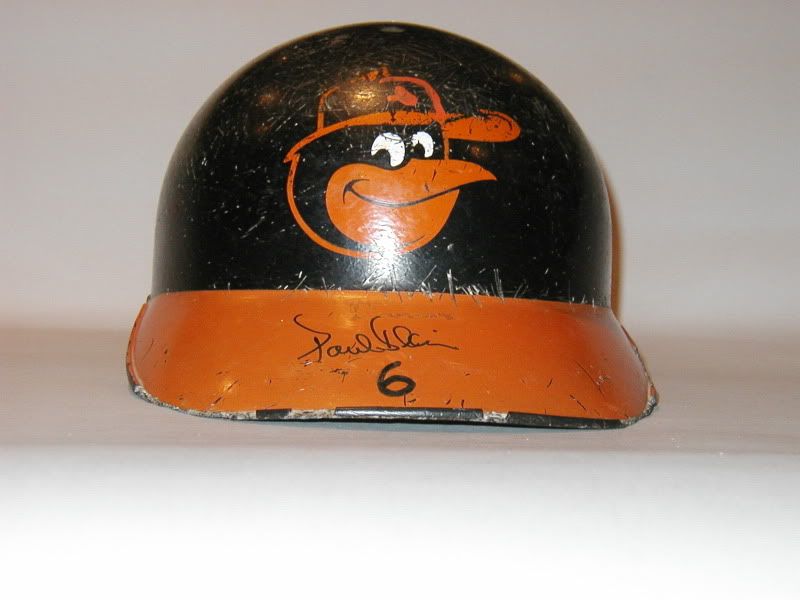
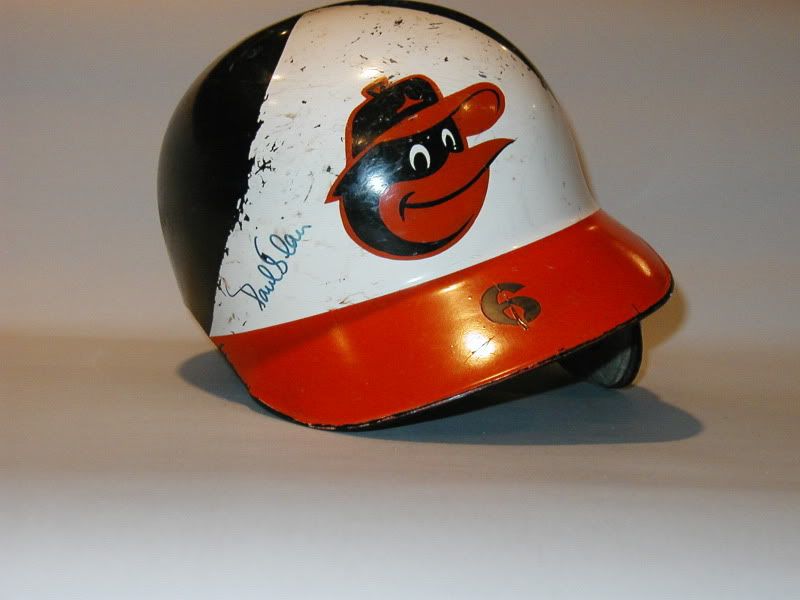
To really bad:
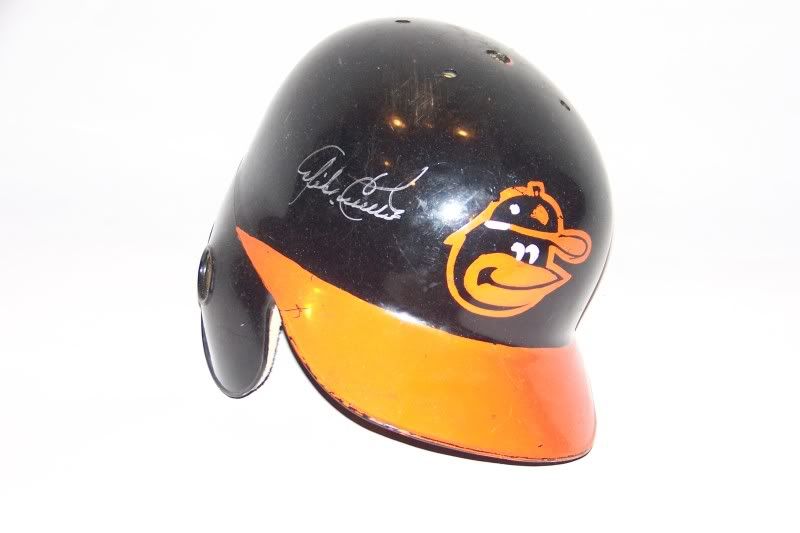
And here's a helmet with the decal:
-
08-16-2011, 01:05 AM #14Junior Member
- Join Date
- Aug 2011
- Posts
- 20
Re: A Study of the Baltimore Orioles Cartoon Bird Cap Logos
[quote name='phutmasterflex' timestamp='1312471846' post='1607746']

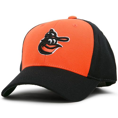
This is a New Era re-release that I bought. It doesn't have that New Era logo on the side and the back doesn't have the MLB logo. It's my favorite Orioles cap. This is the 1983 World Series one if I recall.
[/quote]
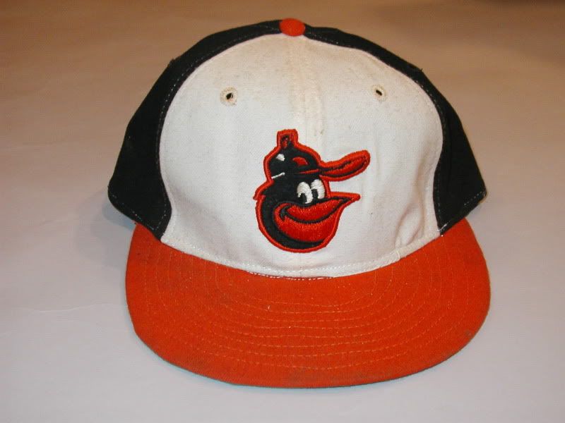
That's the one cartoon cap repro out there that is pretty much an exact replica.
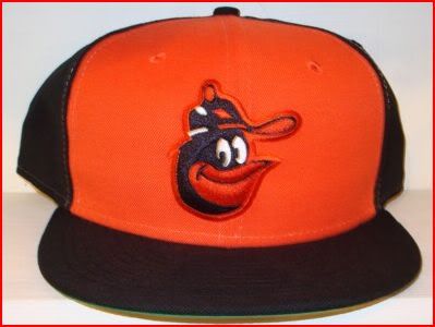
Here's the actual game worn version, also made by New Era:
-
08-16-2011, 01:50 AM #15Banned
- Join Date
- Aug 2011
- Posts
- 316
Re: A Study of the Baltimore Orioles Cartoon Bird Cap Logos
Why does the new era hat logo look like the beanie baby CAW who keep in mind is a CROW lol
-
08-16-2011, 01:51 AM #16Junior Member
- Join Date
- Aug 2011
- Posts
- 20
Re: A Study of the Baltimore Orioles Cartoon Bird Cap Logos
Well, I guess that Orioles baseball card book I have to reference, with the 1/4 size pics, really isn't detailed enough to tell which logo is being worn. I just checked out a few actual cards from a dealer friend of mine and discovered this on a couple '75('74 season) cards:
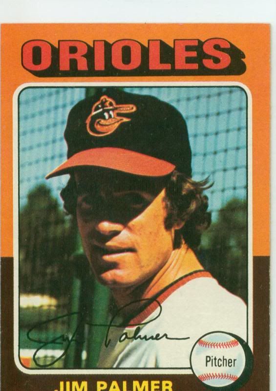
It's Jim Palmer with the bird that would later be seen next year with the up turned beak against the white panels.
So maybe they used this logo for the last year of the black crowned caps and in '75, AJD used it in the transition to their white and orange panel caps?
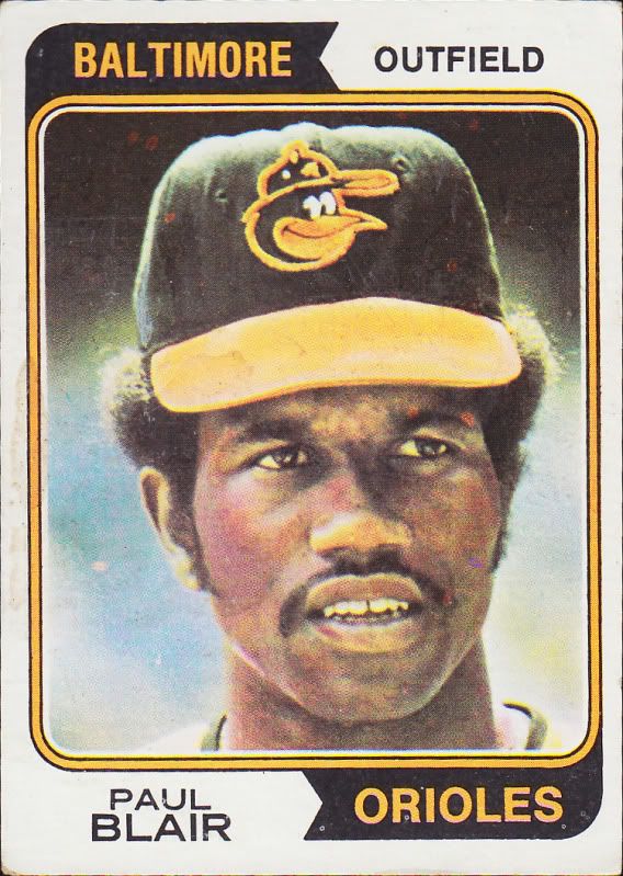
Checked a couple cards from the '74('73 season)set, and it appears to be the more common '66 bird:
-
08-16-2011, 08:17 AM #17Senior Member
- Join Date
- Jul 2011
- Posts
- 133
Re: A Study of the Baltimore Orioles Cartoon Bird Cap Logos
Great job guys...bring back the cartoon bird!!
-
08-16-2011, 09:24 AM #18Senior Member
- Join Date
- Jul 2007
- Posts
- 933
Re: A Study of the Baltimore Orioles Cartoon Bird Cap Logos
Bring it back??... Wieters already has... he wears a Black / White / Orange helmet with the cartoon Bird under his catchers mask
Bert
---------------
Always looking for Matt Wieters, Tettleton, and that Orioles magic
shoremen44@gmail.com
-
08-16-2011, 04:07 PM #19Senior Member
- Join Date
- Nov 2005
- Posts
- 1,422
Re: A Study of the Baltimore Orioles Cartoon Bird Cap Logos
Great research! I've been wanting to do this same kind of examination of the STL logo on Cardinals' caps. It's amazing how much it has changed, often subtly. Thanks for sharing!
Jeff Scott
birdbats@charter.net
http://www.birdbats.com
-
08-20-2011, 04:55 PM #20Member
- Join Date
- Jul 2009
- Posts
- 35
Re: A Study of the Baltimore Orioles Cartoon Bird Cap Logos
Fantastic job! For years I always thought it was just me in my anal viewing and wondering why all the different Orioles logo styles. To this day I am so bothered by the poor repos that I have a difficult time wearing a Throwback. Nothing beats a vintage Wilson, AJD and even a Roman Pro. As a long time Orioles fan, my constant collecting urge has and always will be for vintage Orioles caps. I'd love to meet and share a conversation with you all. Once again. Great job Cartoon Bird on your research and bringing these cap inconsistencies to light. Dave
dfjp56@aol.com


 Reply With Quote


